Flex box :- The Layout Changer
Flexbox can help us to make layouts responsive and it allows us to play around with spacing between the elements inside the flexbox container.*


Flex Box
Flexbox is the layout that can align the content in rows or columns. By using different properties we can align the content at the start, end & center .
Container Properties.
Display:-
- This is the main property that is mandatory on a flex container with the value of display: flex. So, we can an element as a flex container.
flex-direction:-
- Flex direction property allows us to control the direction of the flexbox on its main axis. It has the following Values.
There are mainly two important properties to align the content horizontally and vertically.
How to align content?
Property for Horizontally alignment:-
Justify-Content
Justify-content aligns the text horizontally. There are different properties available to align the container.
Note: In order to apply all the above properties, one has to set the "display: flex" in the parent container.
Syntax : Justify-content: Properties ;
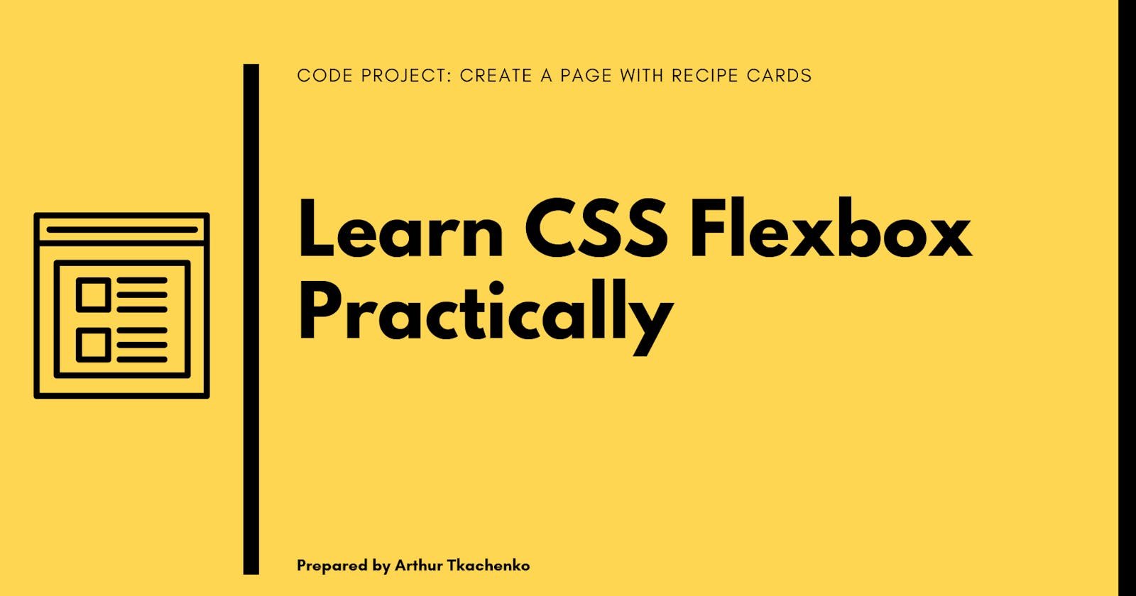
flex-start--Align the content left side of the container.
flex-end--Align the content right side of the container

Center--Align the content horizontal center of the container.

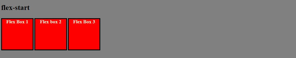
Space-between--Item display with equal spaces between them.
Space-around--Item display with equal spaces around them.

<!DOCTYPE html>
<html lang="en">
<head>
    <meta charset="UTF-8">
    <meta http-equiv="X-UA-Compatible" content="IE=edge">
    <meta name="viewport" content="width=device-width, initial-scale=1.0">
    <title>Document</title>
</head>
<style>
    body{
        background-color: gray;
        margin-left: 50px;
    }
    .parent{
        margin-top: 20px;
        display: flex;
        justify-content: space-around; /* Just change justify-content property here to see different result  */
        gap: 3px;
    }
    .child{
        height: 100px;
        width: 100px;
        border: 3px solid black;
        background: red;
        color: antiquewhite;
        font-weight: 800;
        text-align: center;
    }

</style>
<body>
  <h2 style="color: white; text-align: center;"> Space-Around</h2>
  <h2 style="color: white; text-align: center;"> Space-Around</h2>
    <div class="parent">
        <div class="child">Flex Box 1</div>
        <div class="child">Flex box 2</div>
        <div class="child">Flex Box 3</div>
    </div>
</body>
</html>
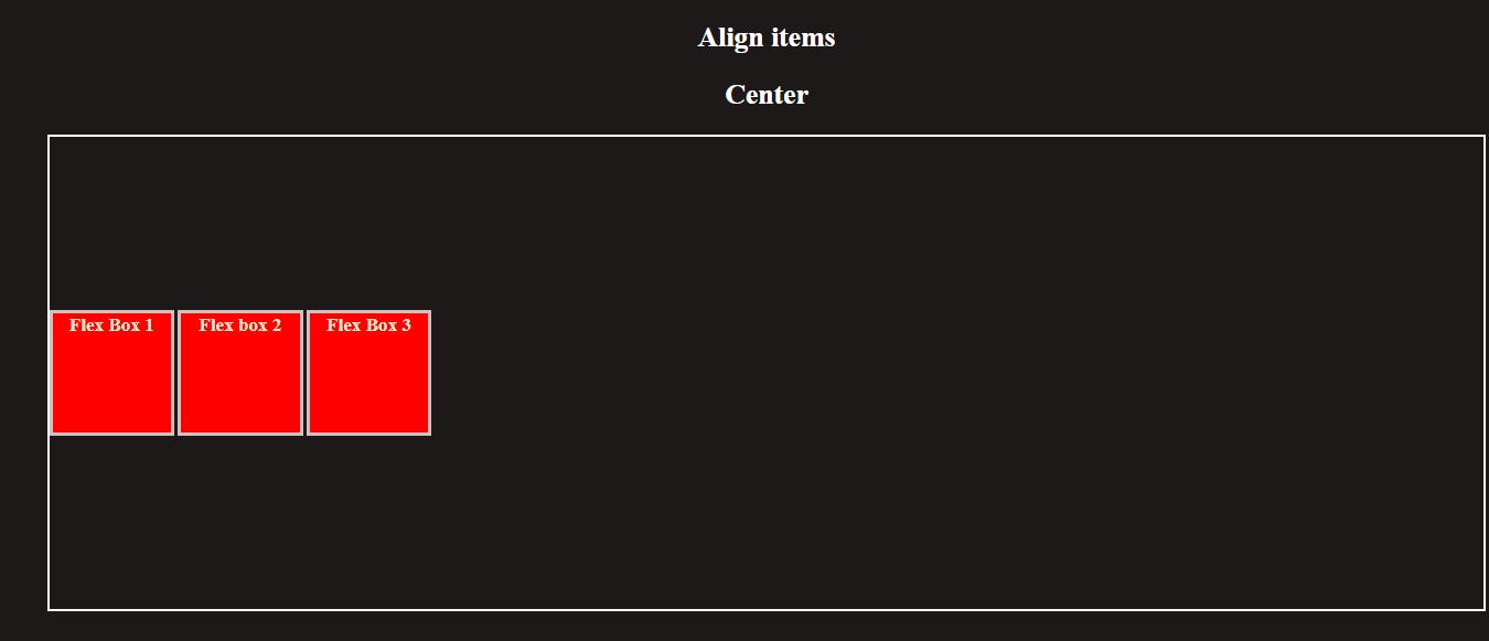
Property for vertically alignment:-
Align-items
Align-Items element aligns the text Vertically. There are different properties available to align the container vertically.
The align-items property aligns the items inside a flex container along the cross axis just like justify-content does along the main axis. Let's see "justify-content: space-around" and "align-items: center" work together:
Syntax : align-Items: Properties ;
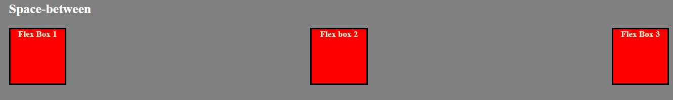
flex-start--Align the content on top of the container.
flex-end--Align the content bottom of the container.

Center--Align the content vertical center of the container.
baseline--Item display baseline of the container.

stretch--Item will stretch to fit in the container.

```plaintext <!DOCTYPE html>
<meta charset="UTF-8">
<meta http-equiv="X-UA-Compatible" content="IE=edge">
<meta name="viewport" content="width=device-width, initial-scale=1.0">
<title>Document</title>